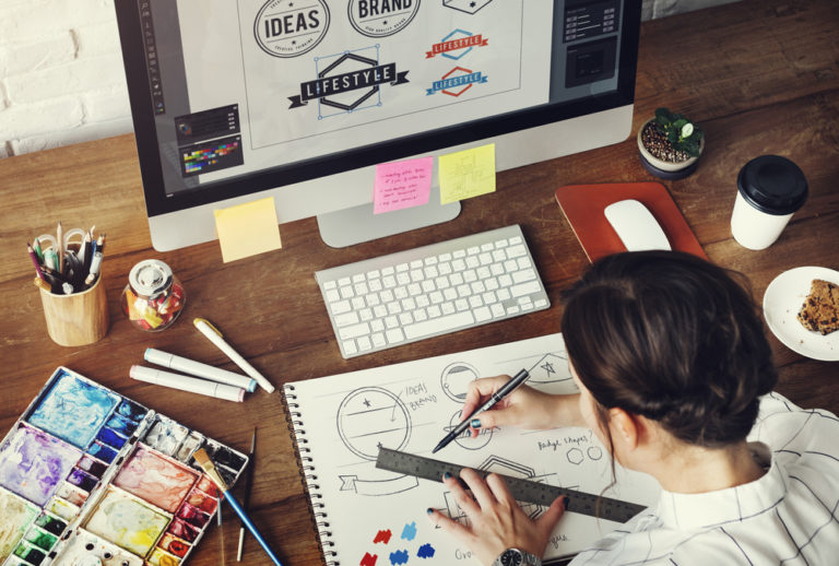
Because there is no easy route when it comes to taking a profession in graphic design, here are some interesting trivia and inspirations that you should know in your long graphic design journey.
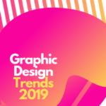
The Practice of Graphic Design
The best way to become a superior designer is to see other designs. A graphic designer should pay attention to all the moments where they encounter design. Design is everywhere, all the time. As Paul Rand said, design is everything. But aside from just seeing design, a graphic design should begin to firmly notice and observe.
Whatever you are working on might have been done already before, and consequently similar goals, problems, and solutions have been designed. By nurturing your observational skills you concurrently improve your ability to explore your own responses and reactions to design. This understanding in turn can inform your design solutions. Knowing what does or does not work in any given design is a key to developing your compassion and refining of your design practices.
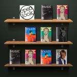
The Graphic Design Deck

Photo courtesy of kickstarter.com
Ben Barrett-Forrest created “The Design Deck”, a smart set of playing cards that each card has facts about graphic design.
All 52 faces contain a useful piece of information about graphic design, including typography, color theory, design techniques, history, and more, with beautiful visual examples. Printed in rich, full colour on high-quality Bicycle stock with air-cushion finish.
Pioneers of Modern Graphic Design: Rob Janoff

Photo courtesy of Stocklogos.com
Why do we need to feature Rob Janoff? Simple: his name one of the names that every graphic designer should know. He is one of the mavericks and thinkers who have made a difference to design.
Janoff designed the Apple logo. He masterminded possibly the most famous mark in the world today while at ad agency Regis McKenna back in 1977. And although it’s been tweaked, the basic form has remained the same ever since – a testament to its simplicity and longevity (and it was created in only two weeks).
Back in 2013, Janoff told us that the idea of an apple with a bite taken out of it was “really a no-brainer”. He continued: “If you have a computer named after a piece of fruit, maybe the image should look like the fruit? So I sat for a couple of weeks and drew silhouettes of apples.
“Bite is also a computer term. Wow, that was a happy accident. At that point I thought ‘this is going to have a wink and a nod with it, and give it personality’.”
An apple with a bite (or byte?) taken out of it was a ‘no brainer’
And as for the now forgotten colored stripes? “The big deal about the Apple II was that it was the only computer that reproduced color images on the monitor, and it was the only computer that you could plug into your home color TV.
“Also, a lot of it had to do with the aesthetic origins of both Steve [Jobs] and I, which was a kind of hippy aesthetic and The Beatles and Yellow Submarine.”
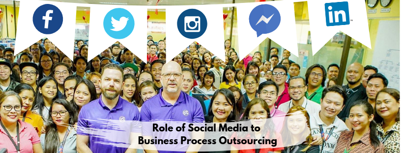
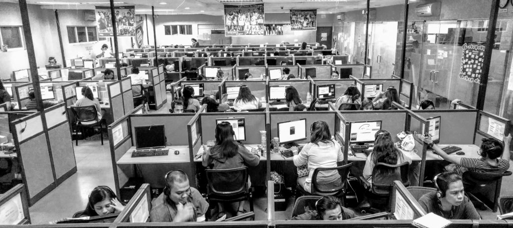
Graphic Design Outsourcing
Businesses are in need of talented creatives to tell their story through branding. This could be anything from designing a logo, advertisements, newsletter, magazine, flyer, or information sheet. Need inspiration? Open Look works from magazine layout, graphics, and templates to help boost your business brand. Call Open Look at 214-403-3755.